
Tables are a fundamental way to organize and present data clearly. A table that looks clean and structured on a desktop can quickly turn into a frustrating mess on mobile with cut-off columns, overlapping text, and forced horizontal scrolling.
If you’re building a WordPress site that needs to present structured information without sacrificing readability, making your tables mobile responsive isn’t optional anymore. It’s a necessity.
In this guide, we’ll walk you through how to build mobile-friendly tables in WordPress that adapt smartly to every screen size without sacrificing design or functionality.
What Makes a Table Truly Responsive?
A well-designed responsive table does more than just “fit” on smaller screens. It needs to adapt in a way that keeps the content easy to read, interact with, and understand across devices. Here’s what to aim for:
Adaptive Layouts
A responsive table shifts its layout based on screen size. On desktops, it may show multiple columns side-by-side. On smaller devices, it should stack content vertically, allow horizontal scrolling, or hide non-essential data for better readability.
Clear Hierarchy
Tables should establish a visual and structural hierarchy using proper headers, bold text, or background highlights. This helps users identify sections and scan key data quickly.
Touch-Friendly Interaction
Interactive elements like buttons or links need to be easily tappable. Adequate spacing between rows, columns, and content prevents accidental clicks on mobile.
Optimized Performance
Tables shouldn’t slow down page loads. Lightweight structure and smart handling of content like icons or images help maintain fast performance, especially on mobile networks.
Accessibility Best Practices
Using semantic HTML (like <th> tags for headers) and screen reader-friendly labels ensures that all users, including those with assistive technologies, can navigate the table easily.
The Problem with WordPress’s Built-In Table Block
When your aim is to display simple and plain structured content, you might be tempted to rely on the default Table block of WordPress. It’s simple, easy to find, and gets the job done for plain text. But when responsiveness enters the picture, that simplicity becomes a limitation.
With the default Table block, you can’t insert different types of content like images, buttons, or icons into individual cells. More importantly, it doesn’t support stacking, horizontal scrolling, or column hiding on mobile. As a result, tables that look fine on desktop often break on smaller screens, columns get squeezed, text overflows, and users are forced to scroll sideways just to read the content. You also can’t customize styles at the row or cell level, highlight important data, or create advanced layouts with merged cells.
For anything beyond simple grids, the default Table block becomes more of a limitation than a solution. That’s why a more modern, block-based table tool that handles real-world use cases and adapts gracefully across devices is worth considering.
How to Create a Mobile-Responsive Table in WordPress
Given the limitations of the default Table block, you need a solution that’s built with responsiveness in mind. Tableberg offers just that. Let’s walk through the process of creating a Mobile-Responsive Table using Tableberg.
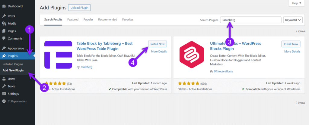
الخطوة 1: تثبيت Tableberg
Go to your WordPress dashboard, head to Plugins → Add New, search for Tableberg, then click Install Now and Activate. The Tableberg block will now be available in your editor.
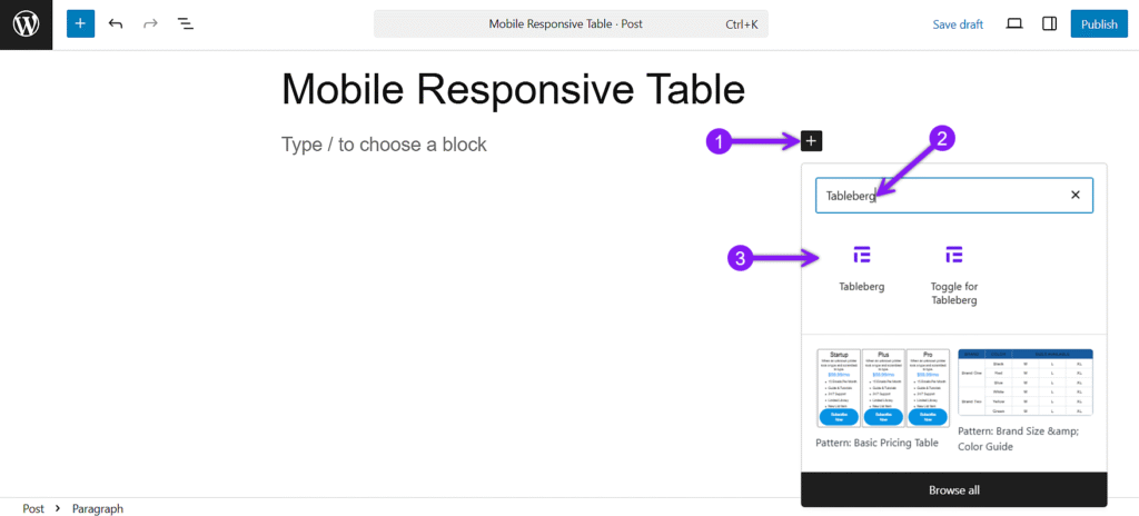
الخطوة 2: إضافة مكوِّن Tableberg
Open the page or post where you want the table. Click the + icon, search for Tableberg, and insert it. Choose the number of columns and rows to get started.
Step 3: Add Content and Style the Table
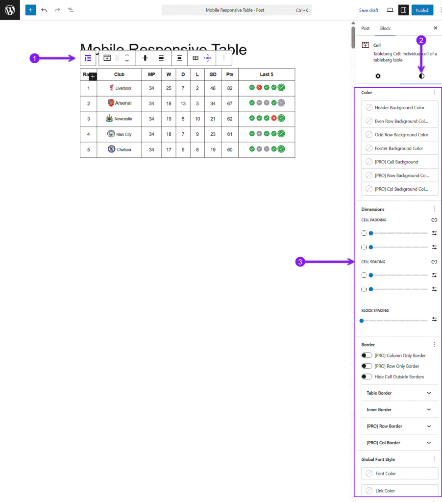
Click any cell and use the + icon inside it to insert blocks like text, lists, buttons, images, or icons. You can mix different types of content based on what your table needs. In the General settings panel, you’ll also find options to set a header or footer, enable sorting, activate a sticky header, or add a search bar.
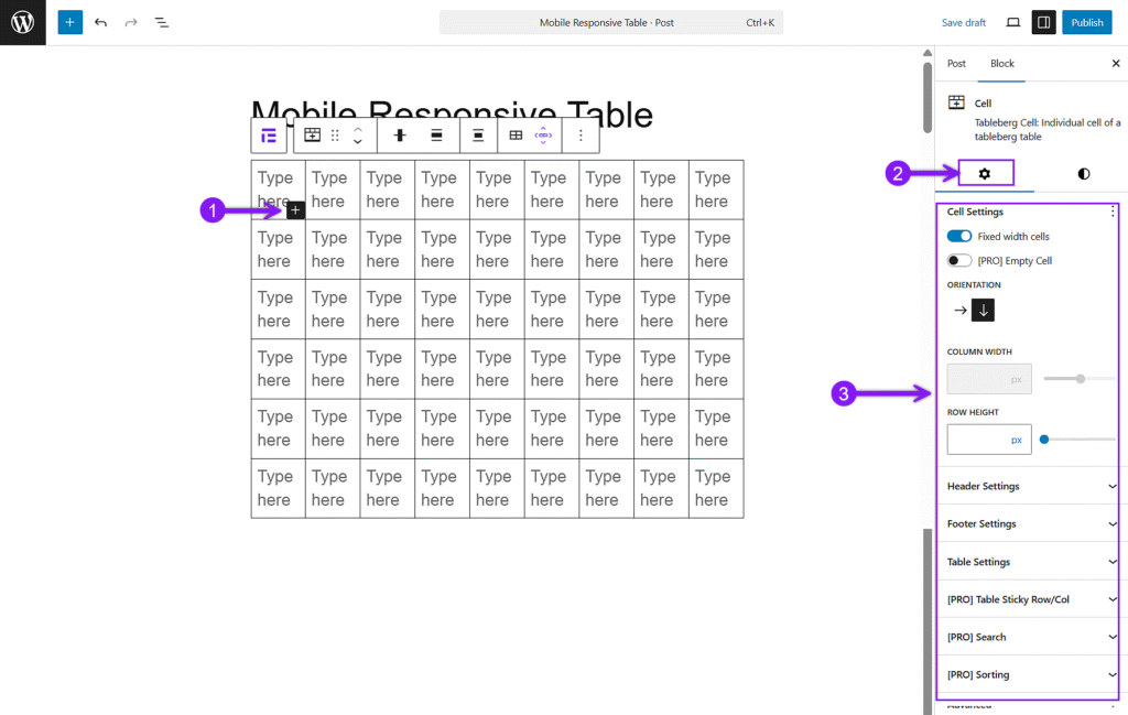
Then, open the Styles tab from the right sidebar to customize your table’s appearance. You can adjust padding, background colors, text alignment, and borders for individual cells, rows, or columns. If needed, merge cells or highlight specific rows to guide attention.
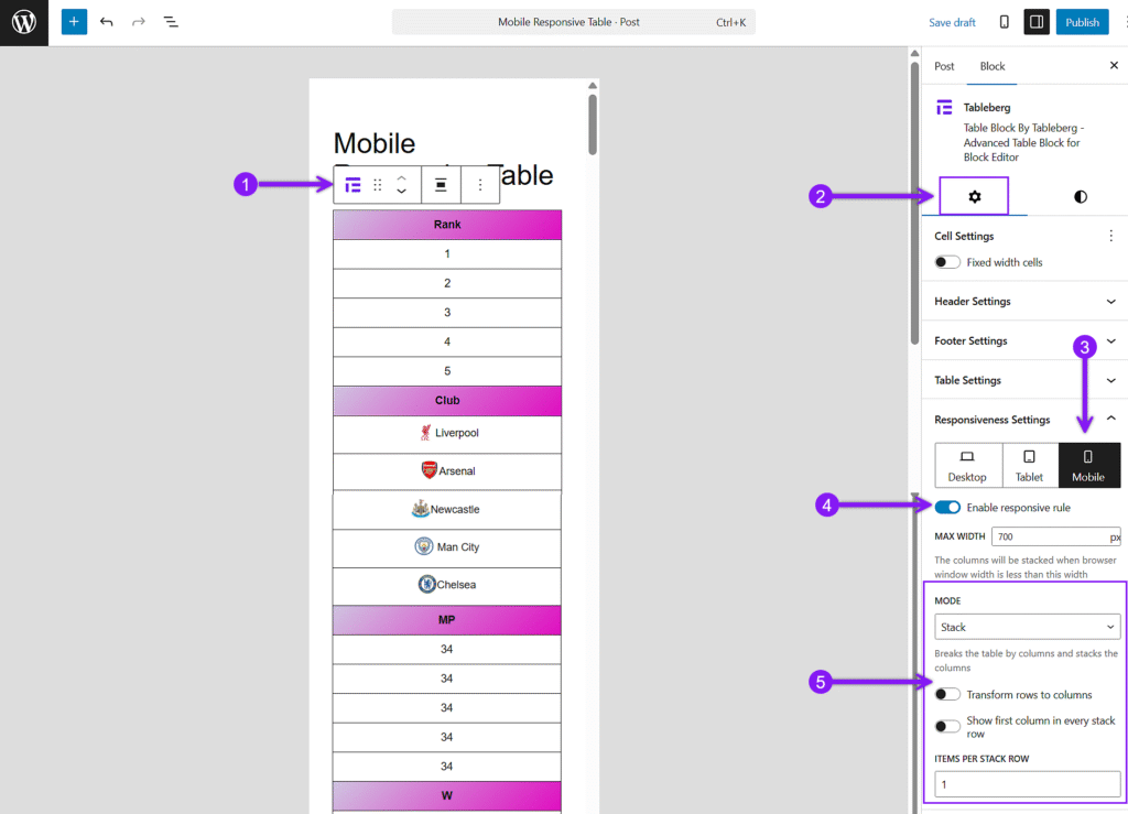
Step 4: Configure Responsiveness Settings
Select the table, open the Settings panel, and scroll to Responsiveness Settings. Enable breakpoints and choose between scroll or stack mode. Adjust stacking direction and items per row for better control on smaller screens.
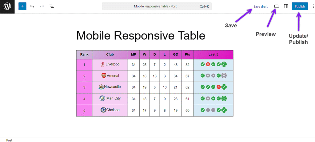
الخطوة 5: المعاينة والنشر
Use the Preview option to check how your table looks on desktop, tablet, and mobile. Make any final tweaks, then click Publish when you’re ready.
خاتمة
Tables will remain a crucial component in presenting structured content clearly, but without mobile responsiveness, even the best-designed tables can break the experience. The default WordPress Table block lacks essential features like stacking, horizontal scrolling, and content flexibility, making it difficult to build tables that work well across devices.
Tableberg offers a better alternative. It gives you full control over layout, styling, and responsiveness right inside the block editor. If you want your tables to look sharp and stay functional on any screen size, switching to a tool built for modern needs is the smart move.
