
誰もあなたのブログを一字一句読んでいるわけではありません。ほとんどの訪問者は、素早くスクロールし、必要なものをざっと探し、すぐに見つからなければ立ち去ります。訪問者の注意を引きつけたいのであれば、構成は中身と同じくらい重要です。
そこでテーブルの出番だ。長い文章を区切り、読みやすくし、コンテンツに視覚的な秩序を与えます。この記事では、あなたのブログの読みやすさとユーザーエクスペリエンスを大幅にレベルアップできる、テーブルの賢い使い方をいくつか紹介しよう。
美しいテーブルを作る
ブロックエディター付き
テーブルがあなたの記事にふさわしい理由
テーブルはデータオタクだけのものではない。複雑なものを見やすく整理するのに役立ちます。特に必要なときに便利です:
高密度な情報や技術的な情報を簡素化する
表はスプレッドシートや分析レポートのためだけのものではない。表は、長い説明を小さく消化しやすい行に分割するので、読者が圧倒されることはありません。
モバイルでの読みやすさを向上させる(最近では大きなプラス要素)
表は、小さな画面でもスキャンしやすいように、よりタイトなフォーマットで情報を表示します。レスポンシブな表は、読者が忍耐力を失うことなく、素早くスキャンして探しているものを見つけるのに役立ちます。
必要な情報をひと目でわかるようにすることで、ページ滞在時間を増やす。
テーブルは、訪問者を長く留めることができる。重要な情報が前もって提示された明確なレイアウトを見た人は、他のサイトに飛び移るのではなく、関心を持ち続ける傾向がある。
視覚的な構造とバランスを用いて注意を誘導する
表は記事の流れを作るのに役立ちます。レイアウトを分割し、読者の目を最も重要なものに導く視覚的なアンカーの役割を果たす。
ブログでテーブルを使う6つの賢い方法
実用的な話をしよう。私が長年にわたって最も重宝してきたテーブルスタイルを紹介しよう。
1. 主要情報の要約
テーブルを使用して、クイックリファレンスのサマリーを作成します。長いガイドやチュートリアルに最適です。小さな「要約」または「一目でわかる」ボックスは、読者が後戻りすることなくハイライトをキャッチするのに役立ちます。
|
|
|
|
|
キヤノンE0S 最高の写真カメラ |
ルミックスGH6 最高の写真カメラ |
ニコンZ6 最高の写真カメラ |

|

|

|
|
$1499 |
$1599 |
$1399 |
|
|
|
|
|
|
|
例えば、上の表を見れば、各カメラの各セクションを調べて具体的な情報を得たり、他のカメラと比較したりする必要はありません。この表から直接情報を得ることができる。
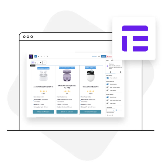
2. 機能やツールを比較する
プラグイン、アプリ、サービスについて書くなら、優れた比較表に勝るものはありません。機能、価格、評価を並べることで、読者がより早く選択できるようになります。特にアフィリエイトコンテンツには便利です。
|
|
|
|

|

|

|
|
Apple AirPods Pro 第2世代 $75 |
SAMSUNG Galaxy Buds 2 Pro TWS $100 |
グーグルPixel Buds Pro $90 |
|
|
|
|
|
|
|
|
|
|
|
3. 長所と短所をリストアップ
段落リストは忘れよう。2列の長所と短所の表は、よりすっきりしていて説得力がある。数秒でバランスの取れた見解が得られるので、読者には好評だ。
ビデオカメラの長所と短所のデモをご覧ください。長所と短所の表を見るだけで、製品の全体像がつかめます。
|
長所 |
短所 |
|
|
4. 現在の統計とデータ
アンケートの結果、機能の内訳、価格リストがありますか?表は、データを威圧的に見せず、読みやすくします。
数字を密集した段落に隠すのではなく、ヘッダー、行、構成で明確に示す。
シンプルな表の方が良いのに、数字のために長い文章を読みたいと思う人はいない。
5. ステップ・バイ・ステップのガイドを整理する
チュートリアルに構造を追加しましょう。ステップ、必要なツール、ヒント、画像をテーブルレイアウトでリストアップすることで、すべてがきちんと整理され、フォローしやすくなります。
特に複雑なガイドでは、アクションとノートを分けることで、一目で内容を理解しやすくなる。
6. テーブル内にボタンを追加する
ユーザーに行動を起こさせたい?次のようなボタンを追加してください。スタート," "詳細を見るまたは今すぐ試す"テーブルのすぐ内側にある。
商品の特徴、価格、比較の横に配置することができます。さりげなく、すっきりしていて、押しつけがましくなく、読み物の流れを邪魔することなく、コンバージョンに役立ちます。
無視できないものモバイル体験
私が目にする最大のミスは?デスクトップでは見栄えがするのに、モバイルでは崩れてしまうテーブルを作ってしまう。
大きな画面ではきれいに見える表でも、携帯電話でははみ出したり、不格好につぶれたりしたら、ユーザー体験としてはゲームオーバーだ。読者はわざわざピンチしたりズームしたりせず、離れていってしまうだろう。
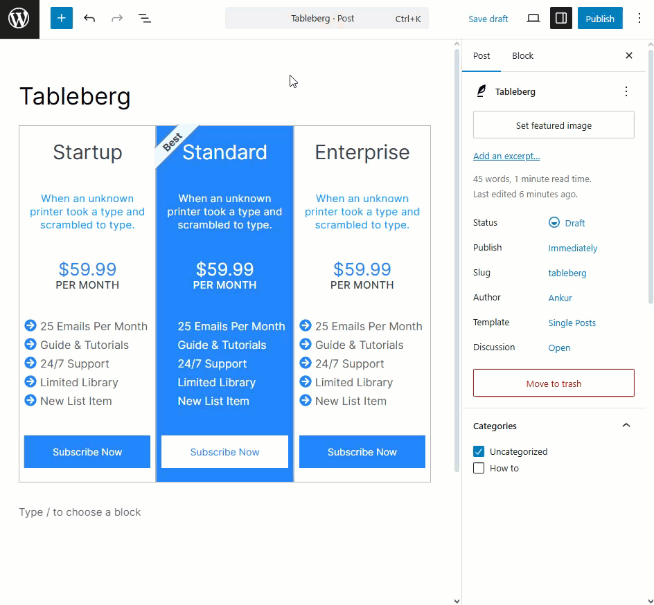
余計なスタイリングが必要な旧式のHTMLテーブルには頼らないこと。以下のようなブロックベースのソリューションを使用してください。 テーブルバーグ-デフォルトでレスポンシブに対応し、小さな画面でもスムーズにコンテンツを調整し、Gutenbergエディタに完璧にフィットします。読者は(そして直帰率も)あなたに感謝するでしょう。
テーブル作成にお勧めのツール
コンテンツの種類によって、私がいつも使っている2つのツールを紹介しよう:
-
テーブルバーグ - Gutenbergで高度でレスポンシブなテーブルを構築するのに最適なツールです。テキストだけでなく、ボタン、アイコン、星の評価、リボン、画像などを各セル内に追加できます。そのため、ビジュアルやインタラクティブ性が重要な商品比較や価格レイアウト、アフィリエイトのコールトゥアクションテーブルに最適です。
-
アルティメット・ブロック - これはテーブルのためだけでなく、スタイルボックス、アコーディオン、トグル、タブセクションでコンテンツを強化したい場合にも最適です。あなたの投稿が基本的なテーブルの他にレイアウトオプションを必要とする場合、これは確かな選択です。ここでも 20以上のプラグイン.ぜひチェックしてほしい。
どちらもコードなしで動作し、コンテンツ制作者、特にブロックエディタ内でコンテンツの見た目や機能をよりコントロールしたい人を念頭に置いて作られています。
ブロガーのためのプロのヒント
テーブルを作り始める前に、私にとって最も効果的だったものを紹介しよう:
-
きれいでスキャンしやすいものにしてください。ごちゃごちゃしない。
-
太字やアイコンを使って注意を引く。
-
一箇所に多くのデータを入れて、テーブルに過負荷をかけないようにする。
-
そして、公開する前に必ずモバイルでプレビューすること。
このようなちょっとした工夫が、読みやすく魅力的なブログを保つのに大いに役立つ。
まとめ
表は単なる書式設定ツールではなく、エンゲージメントを高めるツールです。ざっと目を通すだけでなく、読んでもらうためのツールなのです。ですから、もしテーブルを使わずに文章を書いているのなら、レイアウトを見直す時です。
今すぐTablebergを試して、コンテンツをより良くするテーブルを作り始めましょう。コーディング不要。面倒な作業もありません。より良い構造だけ。
続きを読む

