
比較表は、表面的にはシンプルに見えるかもしれませんが、ユーザーの意思決定を支援する上で大きな役割を果たします。機能を並べて並べることで、これらの表は当て推量を取り除き、ユーザーが各製品やサービスの特徴を確認するのに役立ちます。
製品ページ、ブログ、SaaSサイト、比較レビューなどで目にしたことがあるだろう。これらの表は、行に機能を列挙し、列に各製品やプランを配置することで機能します。チェックマークやダッシュ、微妙な色のハイライトなどのアイコンで、複雑な情報を簡単に消化することができます。
この投稿は、単なる例の羅列ではない。何が比較表を効果的にするのか、どこが一番効果的なのか、同じ戦略をどのように応用できるのかを理解するためのものだ。さあ、始めよう。
実際の機能・価格表の例
1.ドロップボックス
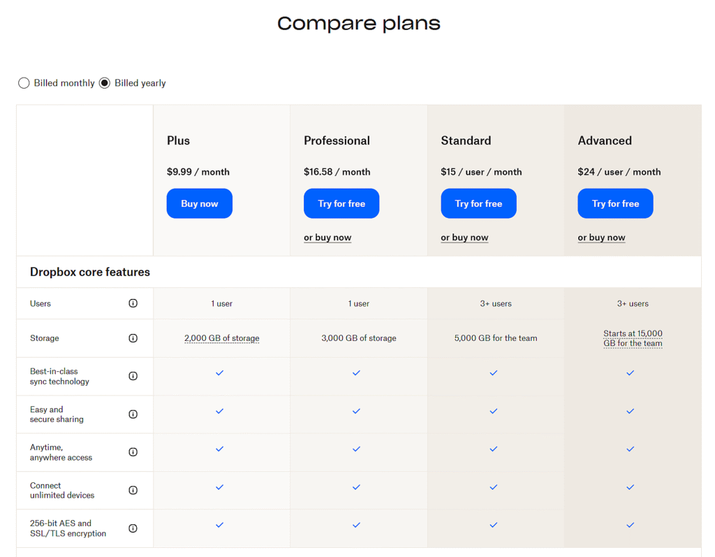
機能と価格の比較表
-
請求サイクルの切り替えができるシンプルなレイアウト。
-
すべてのプランでサイド・バイ・サイドの機能マッチングを実現。
-
チェックマークと一緒にテキスト値を使用します。
-
ストレージやユーザー数の制限など、主要なスペックを紹介。
たとえ複数のプランがあっても、比較表をすっきりさせ、拡張性を保つ方法の好例。機能ツールチップや固定ヘッダーなどの微妙なディテールが、ミニマルになりすぎず、ユーザーフレンドリーを保っている。
2.文法
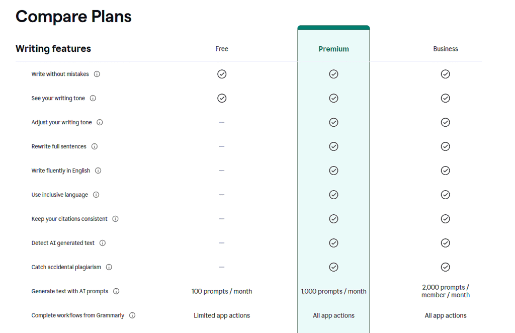
機能比較表
-
各プランに含まれる内容を視覚的に明確にフォーカス。
-
デザインの乱れを最小限に抑え、一貫したアイコンの使用。
-
AIプロンプトの制限など、使用量に応じた機能を表示。
-
機能アップによるアップグレードパスを強調。
機能だけを比較する場合は、わかりやすさが重要です。Grammarlyは、アップグレードによって何がアンロックされるかを、きれいなアイコンと構造化された行を使って、価格の混乱を招くことなく正確に表示することで、これを釘付けにしています。
3.インターホン
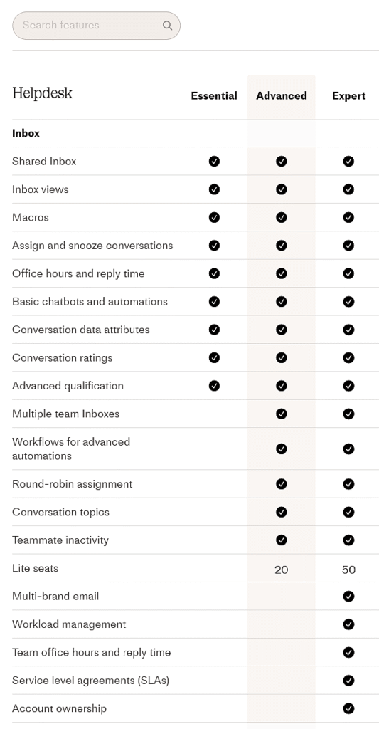
機能比較表
-
受信箱」のようにカテゴリー別に整理されている。
-
チェックマークと数字のミックス(座席数制限など)。
-
控えめなハイライトでエレガントな視覚的リズム。
-
特定の機能を見つけるための検索オプションがある。
このレイアウトは、機能リストが長くてもプレミアム感を出したい場合に有効です。Intercomのように、プラン価格と同じくらい機能の充実度が重要なツールに最適です。
4.セムラッシュ
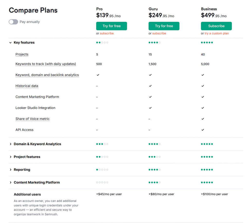
価格と機能の比較表
-
機能の有無と使用量の上限を示す。
-
拡張可能な行は、セクションに機能をグループ化します。
-
アドオンの価格は以下に明確に表示されている。
-
プランレベルの比較に役立つ視覚的な手がかり
この形式は、多くのツールやモジュールを持つSaaSに最適です。アクセスを比較するだけでなく、規模を比較します。高度なマーケティング・スタックやアナリティクスを提供するプラットフォーム向けの賢いアプローチです。
5.アマゾン

製品・機能比較表
-
直接購入が可能な商品画像
-
定性的な情報(定格)と定量的な情報(ワット数)が混在している。
-
ライブ価格と割引がインラインで表示されます。
-
型番、電圧、スペックの紹介。
ビジュアル、価格、スペック、レビューのすべてが重要な、実際の製品を比較する方法の完璧な例です。未加工の製品データを、意思決定に焦点を当てたレイアウトに変えます。
6.ソニーFXシリーズ
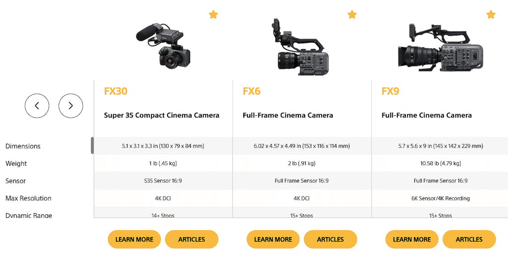
特徴比較マトリックス
-
サイズ、重量、センサーなど、高度に構成された技術スペック。
-
テーブルを囲む気が散らないようにする。
-
行の書式を統一し、見やすくする。
-
"スター "のアイコンは、傑出したモデルを示している。
ギアや電子機器を比較する場合、色よりも一貫性が重要です。このマトリックスは、構造化されたスペックが派手なビジュアルよりもいかに雄弁であるかを示している。
7.パイプドライブ
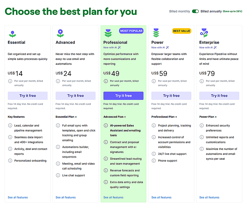
価格と機能の比較表
-
コラムは特集のぼかしを重ねたもの。
-
"一番人気 "と "お買い得 "のタグが目立つ。
-
各プランは、前のプランの上に徐々に積み重ねられていく。
-
すべてのプランで明確なトライアルCTAを。
マーケティングと比較のハイブリッド。他のもののように列ベースではないものの、アップグレードの価値を伝え、各レベルで何がアンロックされるのかをユーザーが確認できるようになっている。
プロフェッショナルのための黄金ルール
もしあなたが、比較表は行と列に機能を積み重ねるだけのものだと思っているなら、考え直してほしい。本当に優れた比較表は、データを表示するだけではありません。ここでは、テーブルを実際に機能させるためのルールを紹介する:
どのテーブルも決断に傾くはずだ。
ただすべてを並べ、ベストを祈るだけではいけません。ハイライトや列の配置、さりげないデザインのトリックなどを使って、選んでもらいたい選択肢を指し示すようにしましょう。
同じだけでなく、違いを強調する。
どのプランも同じような機能を備えているのであれば、テーブルの意味はない。それぞれのプランの特徴に焦点を当てること。
読むのではなく、スキャンされるようにデザインする。
誰もテーブルの中の長い文章を読みたくはない。タイトにまとめましょう。アイコン、太字のキーワード、きれいな間隔がすべてを変える。
最良の選択肢は当然の選択のように感じられるはずだ。
視覚的に目立ち、理解しやすく感じられるものでなければならない。ごちゃごちゃせず、より明確に、より強いコールトゥアクションを。無理強いせず、勝たせる。
モバイルは最初であって最後ではない。
スマホで崩れてしまったら、それは壊れている。トグルやスタッキング、スクロール可能なレイアウトなど、小さな画面でも比較しやすいものを使いましょう。
ものを塊にまとめる。
30の機能を長いリストに放り込んではいけません。基本、サポート、統合などのカテゴリーに分けましょう。そうすることで、人々が関心のあることに集中することができます。
コンテクストを与える。
良いテーブルは "これが情報です "と言う。優れた表は、"あなたが今すぐ行動すべき理由はこれです "と言う。上に一行、下にボタン、あるいはその両方を追加する。フレーミングは重要だ。
ベスト・ソリューション・フォー・デザイン 比較表
プロフェッショナルな外観と優れたパフォーマンスを備えた機能比較表や価格比較表を作成したい場合、 テーブルバーグ はそのために作られたプラグインです。WordPressのブロックエディター内で動作し、コードやショートコードを必要とせずにレイアウトやコンテンツを完全にコントロールすることができます。
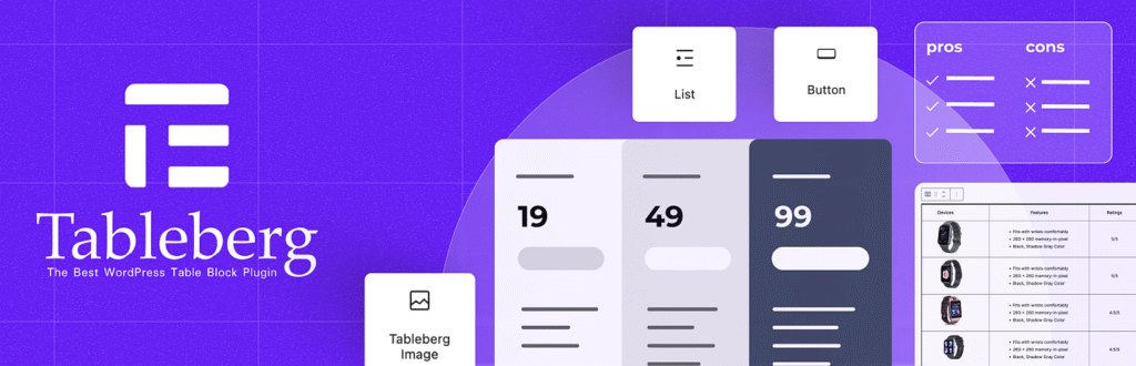
Tablebergの主な特長
-
テキスト、画像、ボタン、アイコン、星評価、リボンなどのリッチコンテンツを追加できます。
-
ブロックエディタ内で価格表、機能マトリックス、スペック表を作成できます。
-
カスタムスタイルでヘッダーとフッターセクションを使用します。
-
カラーリボンやバッジでトッププランを強調する。
-
列のソート、スティッキーヘッダー、検索バーを有効にする。
-
Gutenbergでネイティブに動作し、ショートコードは必要ありません。
-
デフォルトでモバイルとタブレットに対応。
-
カテゴリーや価格タイプを切り替えるためのトグルオプションが含まれています。
Tablebergを使用して、独自の機能または製品比較表を作成する正確な方法については、こちらをご覧ください、
詳しいチュートリアルを見る.
結論
結局のところ、比較表は物事を簡単にするはずだ。単に機能や価格を並べるだけではない。何が重要かを理解し、考えすぎずに素早く決断できるようにすることなのだ。
上記の例はすべて異なる道を歩んでいるが、目的は一つである。ユーザーを導くことだ。もし自分で作るのであれば、シンプルに、明快に、そして適切なツールを使うこと。本当に必要なのはそれだけだ。

