
A high-converting pricing table is one that effectively persuades, reassures, and guides visitors toward making a decision, whether that means purchasing a plan, signing up for a trial, or reaching out to sales. Instead of just presenting numbers, it should build confidence and remove hesitation.
For WordPress users, creating an effective pricing table comes down to three key principles. It needs to present value in a way that resonates with your audience, remove any friction that slows decision-making, and structure the design so that users naturally move toward your call to action. Done right, it bridges the gap between interest and commitment, turning hesitant visitors into confident buyers.
In this guide, we break down the 13 essential features that transform a basic pricing table into a conversion-driving powerhouse. These features ensure that your WordPress site capitalizes on every visitor’s intent.
- 1. Keep the Number of Plans Simple
- 2. Clear and Concise Feature Descriptions
- 3. Highlight the Best Plan
- 4. Make Pricing Crystal Clear
- 5. Offer a Monthly & Annual Pricing Toggle
- 6. Strong, Action-Oriented CTA Buttons
- 7. Trust Signals (Reduce Purchase Anxiety)
- 8. Ensure the Table is Mobile-Friendly
- 9. Make Pricing Tables Easy to Compare & Read
- 10. Direct Payment Gateway Integration
- 11. Keep Design Consistent with Your Brand
- 12. Fast Loading Speed
- 13. Leverage Urgency and Scarcity
- Final Checklist for a High-Converting Table
- How to Implement These Features in WordPress?
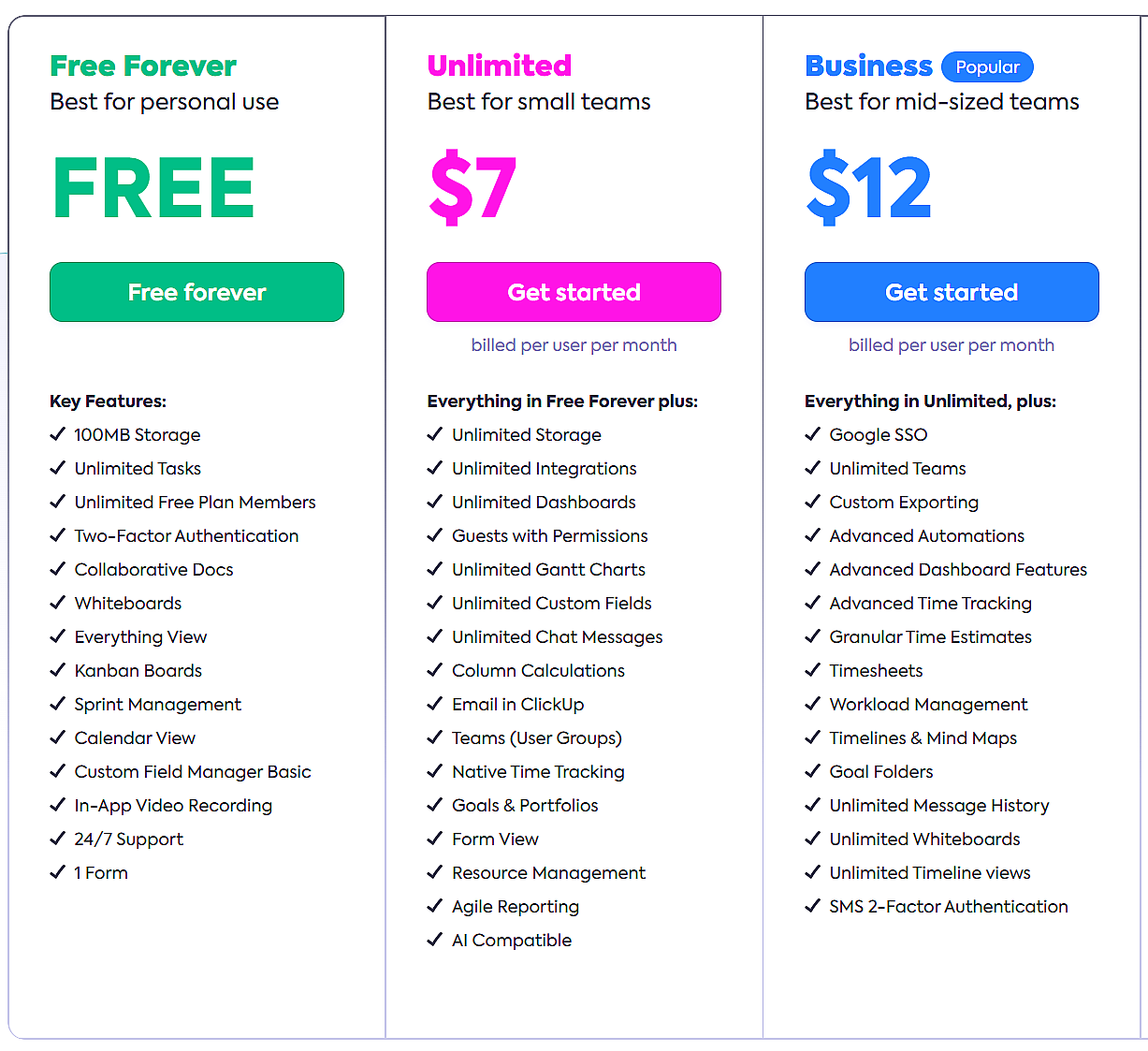
1. Keep the Number of Plans Simple
When people face too many choices, they often fail to choose at all. That’s why high-converting pricing tables typically stick to three to four plans. This creates a clear comparison without overwhelming the user.
2. Clear and Concise Feature Descriptions
Visitors shouldn’t have to decipher complex jargon to understand your pricing plans. Keep descriptions short, scannable, and benefit-driven.
Best Practice for Feature Descriptions
- Use bullet points to highlight key features.
- Keep each point under 10 words.
- Prioritize the benefits customers care about most.
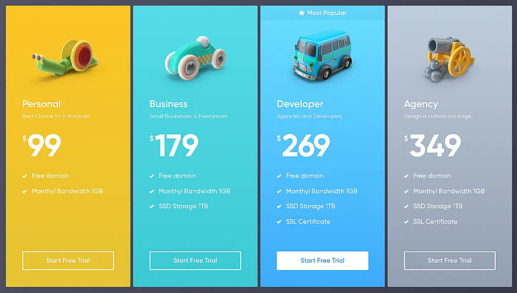
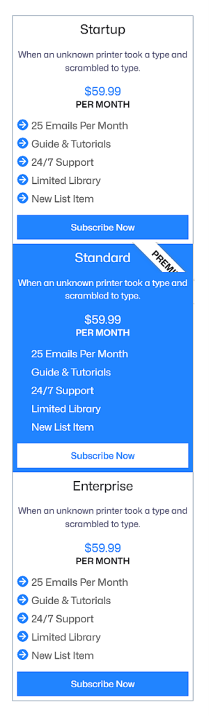
3. Highlight the Best Plan
Not every visitor will instantly know which plan suits them best. That’s why many successful pricing tables highlight one option as the best choice.
How to do it?
- Add a badge like “Most Popular” or “Best Value.”
- Use a different background color to make it stand out.
- Position it slightly larger than the other plans.
4. Make Pricing Crystal Clear
Pricing should be bold, prominent, and easy to read at a glance. Never bury your price in fine print.
Best Practices for a Clear Pricing
- Use large font sizes for the price.
- Include monthly & annual pricing options.
- Show discounts clearly, as in “Save 20% with yearly billing”.
5. Offer a Monthly & Annual Pricing Toggle
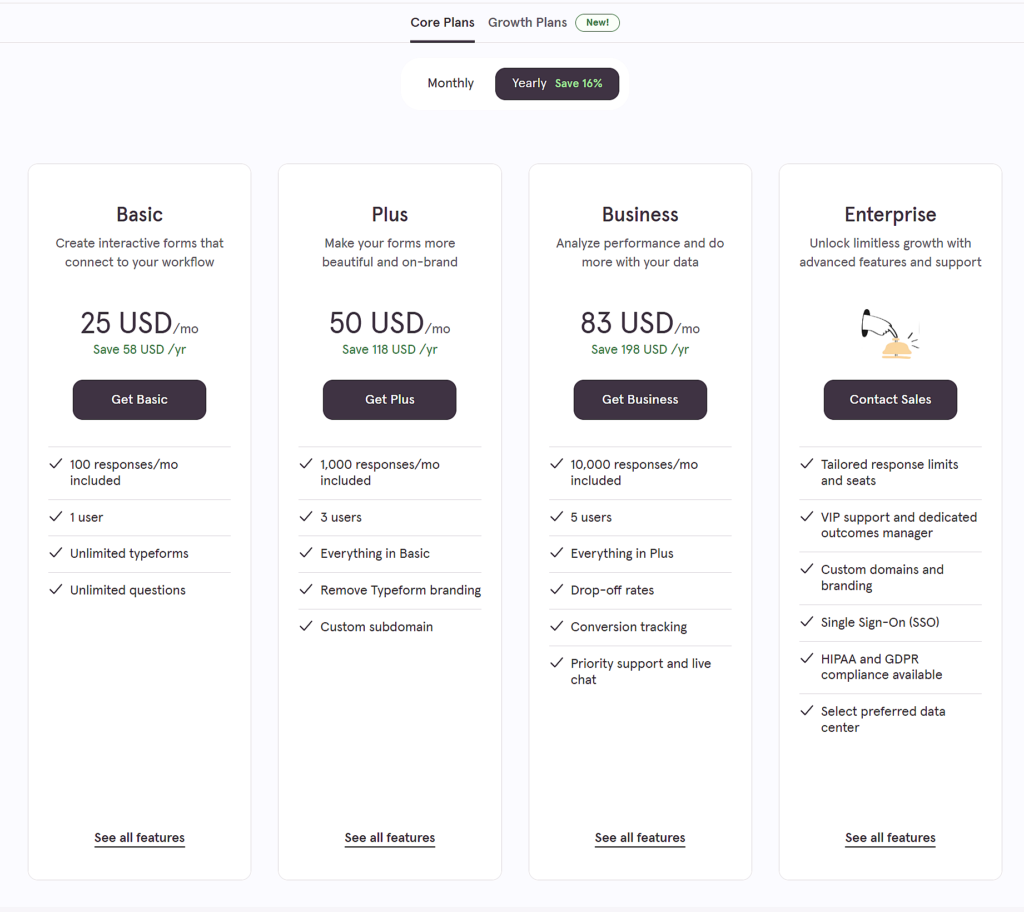
Some customers prefer monthly payments, while others want long-term savings. A simple toggle switch lets them compare both instantly.
Best Practices for Pricing Toggle
- Place the toggle above the pricing table for easy visibility.
- Highlight the discounted yearly rate to encourage long-term commitments.
- Ensure the switch updates prices dynamically without page reloads.
6. Strong, Action-Oriented CTA Buttons
Your Call-to-Action (CTA) button is where conversions happen. Make sure it’s clear, visible, and compelling.
Weak Example: “Buy”
Better Example: “Start Your Free Trial” or “Get Pro Now.”
How to Improve CTAs?
- Use contrasting colors so buttons stand out.
- Make them large enough to tap on mobile.
- Keep text action-driven (Start, Upgrade, Get, Join).
7. Trust Signals (Reduce Purchase Anxiety)
A visitor on the fence needs reassurance before committing. Add trust signals to remove hesitation.
Best trust signals to include
- 30-Day Money-Back Guarantee
- SSL Secure Payment Badge
- Testimonials & Reviews
- Number of active users (e.g., “Trusted by 50,000+ customers”)
8. Ensure the Table is Mobile-Friendly
These days, more than half of all website traffic comes from phones and tablets. A table that looks great on desktop but breaks on mobile will kill conversions.
How to optimize it?
- Use a stacked layout for mobile.
- Ensure buttons are easy to tap.
- Test with Google’s Mobile-Friendly Test.
9. Make Pricing Tables Easy to Compare & Read
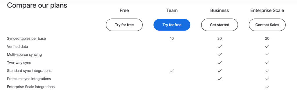
A pricing table’s main job is to help users compare different plans at a glance. If the layout is cluttered or hard to scan, visitors may hesitate or leave without choosing a plan. A clear, structured, and visually engaging table makes decision-making perfectly simple.
Best Practices for Comparison & Readability:
- Use side-by-side layouts to highlight differences between plans.
- Display key features in columns with checkmarks, icons, or tooltips.
- Use strikethroughs or faded text for unavailable features to avoid clutter.
- Highlight which plan has the best value.
- Use horizontal dividers for clear separation.
- Tooltip pop-ups for additional details.
10. Direct Payment Gateway Integration
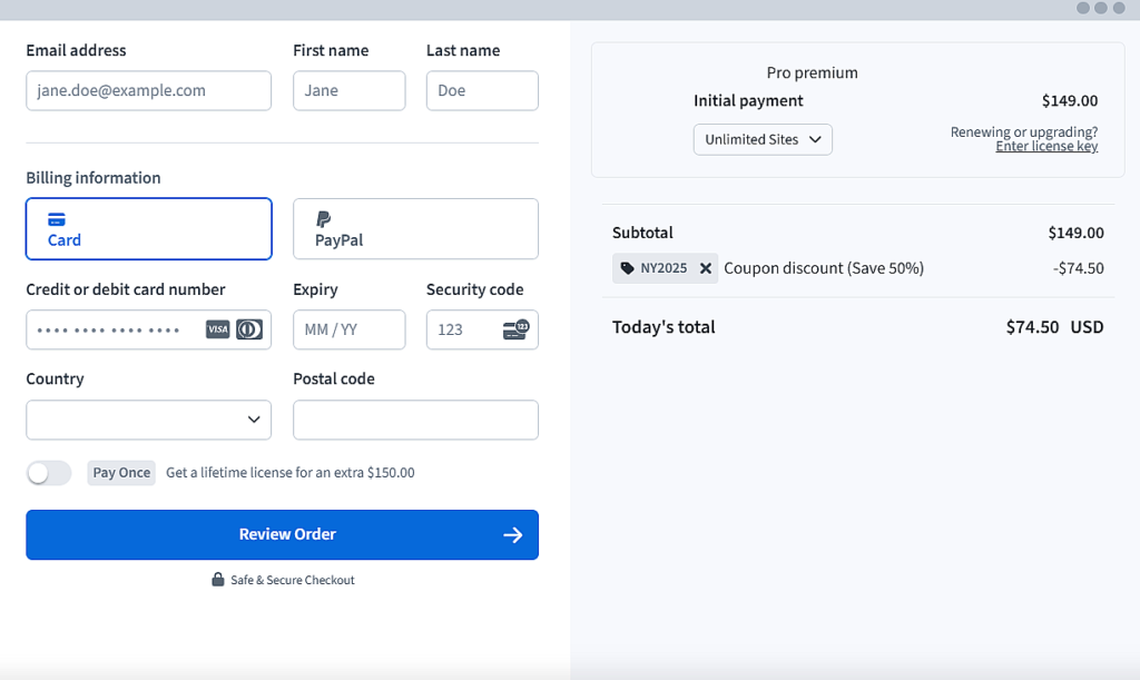
A high-converting pricing table should not just display prices; it should lead users directly to checkout. If there’s friction in the payment process, potential customers might drop off before completing their purchase.
Best Practices for Payment Integration:
- Link the CTA button to a checkout page (instead of a generic sign-up form).
- Support multiple payment methods (credit cards, PayPal, Stripe, Apple Pay).
- Clearly display accepted payment options to build trust.
- For subscription-based plans, automate recurring payments to reduce churn.
11. Keep Design Consistent with Your Brand
A pricing table that doesn’t match your site’s style looks untrustworthy. Align the table’s colors, fonts, and styling with your brand identity. Use animations (e.g., hover effects) sparingly to add polish without distracting users.
Best Practices for Consistent Design
- Use brand colors for CTAs and highlights.
- Keep fonts consistent with your theme.
- Ensure spacing & alignment are clean.
12. Fast Loading Speed
Speed directly impacts conversions. A slow pricing table can frustrate visitors and increase bounce rates. Every second of delay reduces conversions by 4.42%, according to Google research.
How to Optimize for Speed?
- Use lightweight pricing table plugins (avoid bloated ones).
- Optimize images/icons to reduce file size.
- Enable lazy loading for pricing tables with heavy graphics.
- Minimize CSS/JavaScript that slows down table rendering.
- Use a fast WordPress hosting provider with caching enabled.
13. Leverage Urgency and Scarcity
People are more likely to take action when they feel a sense of urgency or perceive limited availability. A pricing table that strategically incorporates urgency and scarcity can push hesitant buyers toward a decision faster, leading to higher conversions.
Best Practices for Creating Urgency & Scarcity
- Highlight time-sensitive offers to encourage faster conversions.
- Provide additional perks for the first set of customers.
- Show limited spots or inventory to create FOMO.
- Offer extra features or services for those who act quickly.
Final Checklist for a High-Converting Table
- The layout is clear and structured.
- Plans are limited to 3-4.
- Feature descriptions are concise and scannable.
- The best-value plan is highlighted.
- Pricing is clearly visible, with no hidden fees.
- CTA buttons are bold, high-contrast, and action-driven.
- A billing cycle toggle is included (if applicable).
- Trust signals are present.
- The design is fully responsive.
- A side-by-side comparison layout with checkmarks or icons is used.
- The pricing table links directly to a payment gateway.
- Fast loading speed.
- Urgency or scarcity elements (if applicable).
-
Is the pricing table easy to understand at a glance?
-
Does it solve a specific pain point for your audience?
-
Does it build trust at every step?
-
Is it tested across devices and browsers?
How to Implement These Features in WordPress?
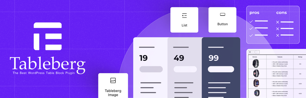
Building a high-converting pricing table is not just about understanding the right features. It also requires a tool that makes implementation easy and efficient. Tableberg, a block-based pricing table plugin for WordPress, allows you to create fully customizable and conversion-optimized pricing tables directly inside the block editor.
With Tableberg, you can:
- Design a structured and easy-to-compare pricing table using checkmarks, icons, tooltips, and strikethroughs.
- Highlight the best-value plan with color customizations, badges, and styling options.
- Enable a pricing toggle for monthly and annual plans, giving users a flexible way to compare billing options.
- Integrate payment buttons inside the table, allowing users to proceed directly to checkout.
- Use sub-blocks like buttons, star ratings, icons, and ribbons to enhance design and engagement.
- Ensure fast loading times with an optimized block-based approach that keeps performance in check.
- Create mobile-responsive tables that adapt seamlessly across devices without extra coding.
Final Thoughts
A pricing table should do more than list prices. It should guide decisions, remove hesitation, and drive action. By applying these 13 essential features, you can create a table that enhances user experience and boosts conversions.
With Tableberg, building a fully optimized pricing table inside WordPress is simple. Its block-based design and advanced features let you create fast, responsive, and high-converting tables without extra effort. Now is the time to put these best practices into action.

