
Standard tables typically work well on desktops. You can see everything fits in place, and the layout stays clean. But when viewed on a phone or a tablet, those same tables often break down. They stretch too wide, forcing users to scroll sideways just to read a single row.
Stackable tables solve this problem by turning each row into a vertical block of information. Instead of displaying data in a single line, the content stacks one under another and produces an easier environment to make the table understandable on small screens.
This layout isn’t useful on a desktop, though. With enough space available, regular tables are easier to navigate and more efficient. Stackable tables are mainly designed to improve readability on mobile devices, not to replace standard tables across all screen sizes.
In this article, we’ll walk you through how to create a stackable table using the Tableberg plugin and adjust it for mobile screens.
What is a stackable table?
A stackable table is a responsive version of a regular table that adjusts its layout on smaller screens. On desktops, a table might appear as a standard grid with rows and columns. But on mobile devices, wide tables can often become difficult to read and require horizontal scrolling. Stackable tables come into play to fix this by turning each row into a vertical block, where the column labels are shown above each value. This makes the content easier to read and scroll through on narrow screens without losing any information. In most cases, this is done using CSS or plugins that support responsive table layouts. The best results come from using plugins with built-in mobile settings or utility classes that detect screen width. But it’s better to keep in mind that before applying stacking, you need to check how many columns you have and whether the content stays readable.
Create Stackable Tables in WordPress
To show how stackable tables actually work in WordPress, we’ll be using the Tableberg plugin. It’s simple to use, supports all kinds of content inside table cells, and includes built-in settings for stacking tables on mobile. Let’s move on to the steps.
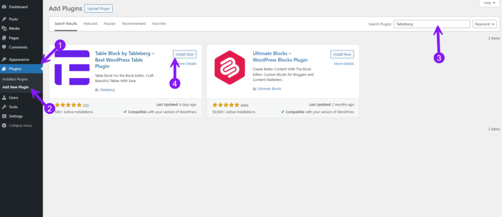
Step 1: Install and Activate Tableberg
From your WordPress dashboard, select Plugins → Add New, then search for Tableberg. Click Install Now, and once installed, hit Activate to start using it on your site.
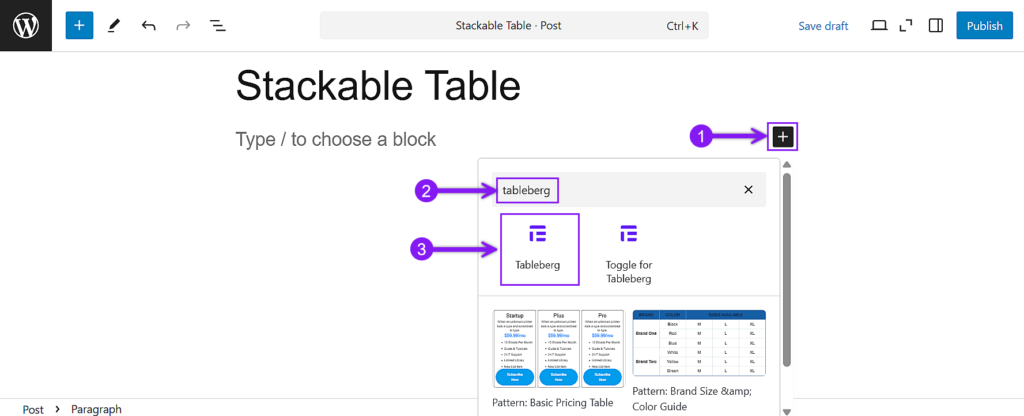
Step 2: Insert a Table
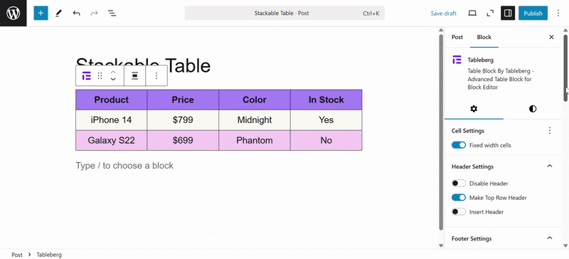
Open the post or page where you want the table. Use the block inserter (+ button), search for “Tableberg”, and insert it. You’ll be prompted to choose the number of rows and columns—set that based on what kind of table you want to create.
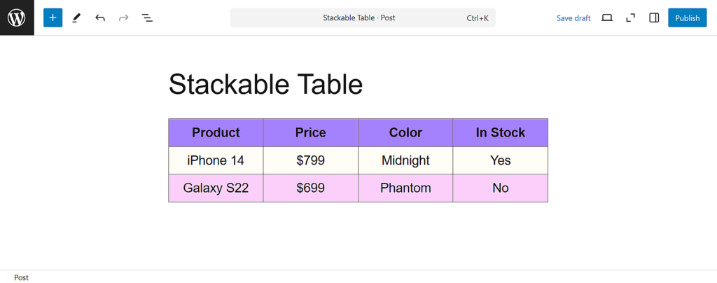
Step 3: Add Content to the Table
Click into each cell and start filling in your content. You can add text, images, icons, star ratings, buttons, ribbons, or lists—Tableberg supports multiple block types inside each cell.
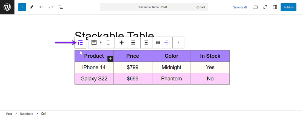
Step 4: Enable Responsive Stacking Mode
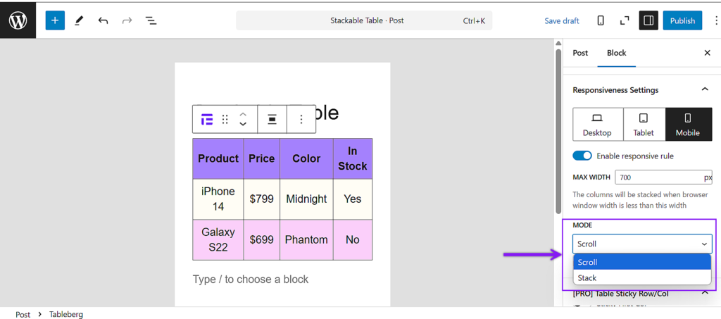
To apply responsive settings, you need to select the whole table first. Click the outer border of any individual cell, and when the toolbar appears, select the tableberg icon from it. This will make sure the entire table is selected.
With the full table selected, look to the right-hand block settings panel. Scroll down until you find the section labeled Responsive Settings. Enable the option that allows the table to adjust on mobile and tablet screens.
Step 5: Choose Stack Mode and Configure Behavior
After enabling responsive mode, you’ll be able to select how the table adapts. Choose Stack instead of Scroll. This transforms each table row into a vertical block to make it easier to view on smaller screens.
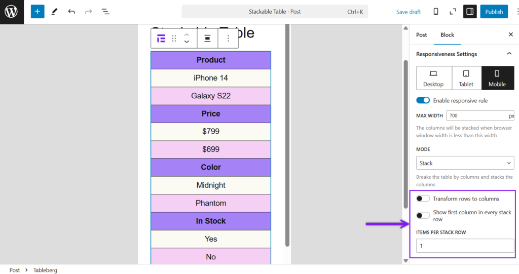
Step 6: Use Advanced Stack Features
Below the mode selection, you can turn on Transform Rows to Columns if you want the table to flip its layout direction. You’ll also find the option to Show the First Column in Every Stack Row, which is useful when the first column contains labels. Lastly, you can set how many items should appear per stack row.
Step 7: Preview and Finalize
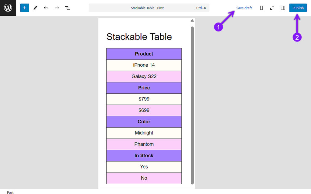
Click the Preview button and check the layout in mobile and tablet view. If everything looks good, go ahead and publish or update your post.
Conclusion
Stackable tables are a practical solution for making content easier to read on phones and tablets, especially when you’re working with simple or moderately sized tables. However, when a table includes too many columns, the stacked format can become lengthy and harder to navigate. In those cases, other techniques like filtering or hiding columns may work better. Still, for most everyday use cases, stacking offers a clean and reliable way to keep your tables mobile-friendly. And in this article, we’ve shown exactly how to create one using Tableberg, from installation to final preview.

