
Tables have always been a fundamental way to organize information. They let you present multiple sets of information in a clear, structured format so readers can scan, interpret, and make decisions quickly.
If you run a SaaS business, sell online courses, offer membership tiers, or provide services with different packages, you’ll eventually fall into the need for a pricing table. It’s one of the most efficient ways to present your plans in a side-by-side format that shows what each option includes and how much it costs.
A responsive pricing table adapts to different screen sizes. On a laptop, it might show all plans in columns; on a phone, it might stack those columns into rows or let you swipe between them. The idea is that the layout stays readable and user-friendly, no matter what device someone uses.
That’s why we’ve prepared this article with the aim of showing you how to create the perfect responsive pricing table in WordPress. Bear with us.
What Makes a Pricing Table Perfect?
A perfect pricing table does more than just list prices. It guides users through the decision-making process with clarity, structure, and just the right amount of visual emphasis. Here’s what it should include:
1. Clear and Focused Layout
Use short plan titles and keep the structure easy to scan. Avoid stuffing too much in. Just highlight the key differences that actually matter to your users.
2. Honest, Upfront Pricing
Always show the exact price along with how it’s billed. Make it clear if it’s monthly or yearly. Avoid phrases like “starting at” or anything that hides the real cost.
3. Side-by-Side Feature Comparison
List what’s included in each plan and make the differences obvious. You can use visual cues like icons or faded text to help, but keep it clean and consistent.
Small Benefit Taglines
A short line like “Best for freelancers” or “Ideal for teams” under each plan can lead your users to make a decision without overthinking.
Action-Driven Buttons
Each plan should have a clear button that prompts action. But don’t forget to use a distinctive color, unique size, or a “Most Popular” label to make your best value plan stand out.
Mobile-Ready Layout
Your table should adapt automatically to phones and tablets. The very basic requirement is to stay readable without forcing users to zoom or scroll sideways.
Optional but Useful Add-ons
Toggles for switching between monthly and yearly pricing, quick tooltips, or a nearby FAQ link help answer common questions before users even ask them.
Why Skip the Default Table Block for Pricing Tables?
When you’re planning to create something in WordPress, your first intention might be to do that with the core features of the builder. Why waste your time with plugins when that can be done with the core blocks, right? In some scenarios, your instincts will serve you well. But when it’s about building a responsive pricing table, the default Table block just can’t cut it.
It’s fine for presenting simple data, but that’s where it ends. You can’t insert different types of content inside cells, can’t style or highlight them individually, and there’s no built-in mobile responsiveness. It also lacks toggle functionality and limits you to plain text. If you try using it for a pricing table, the layout may look fine on desktop but quickly fall apart on smaller screens. There’s no stacking of columns, no way to add badges or icons, no call-to-action buttons, and no way to visually emphasize a featured plan.
In short, it lacks the flexibility and responsiveness a proper pricing table needs. That’s why relying solely on the core blocks isn’t always the most efficient choice.
Create a Responsive Pricing Table in WordPress
Many plugins let you build pricing tables, but they often come with unnecessary settings or use clunky interfaces. Tableberg is different. It’s made for the block editor, supports multiple content types, and is built with responsiveness in mind. Tableberg has an impressive set of features that are ready to serve according to users’ needs.
Versión gratuita |
Pro Version |
|---|---|
Paragraph, List, Button, Image blocks |
Star rating, Icon, Ribbon, Custom HTML blocks |
Responsive design with mobile stacking |
Toggle feature for monthly/yearly pricing |
Header and footer customization |
Sticky rows and columns |
Cell merging |
Adjustable column width |
Color customization for header, footer, rows and columns. |
Color customization for individual cells, rows and columns. |
Table and inner border setting and styling |
Row and Column border setting and styling |
Global font and link styling |
Search and sort functionality |
Plantillas prefabricadas |
Empty Cell availability |
Here’s how you can create a responsive pricing table using Tableberg.
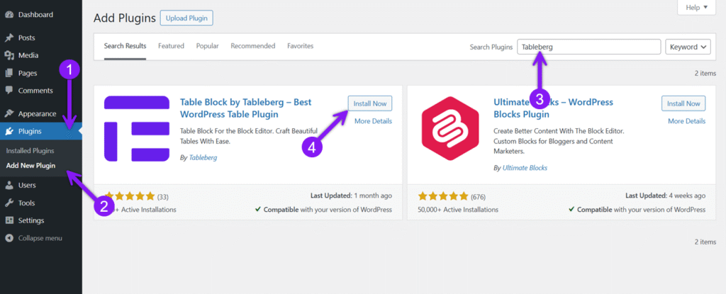
Paso 1: Instalar y activar Tableberg
Go to your WordPress dashboard, move to the Plugin section, and click Add New. Afterwards, search for “Tableberg,” click to install it, and subsequently, activate it. Once active, you’ll find the Tableberg block available inside the block editor.
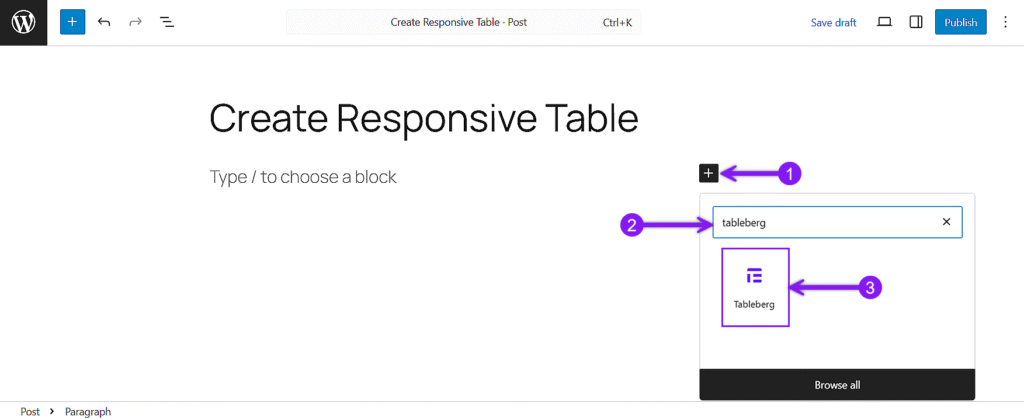
Step 2: Add the Tableberg Block
Next, head to any existing page or create a new one where you want to insert the pricing table. From your editor, click the block inserter + icon to add a new block, search for “Tableberg” and insert it. Choose the number of columns based on how many pricing options you want to show.
Step 3: Fill in the Pricing Details
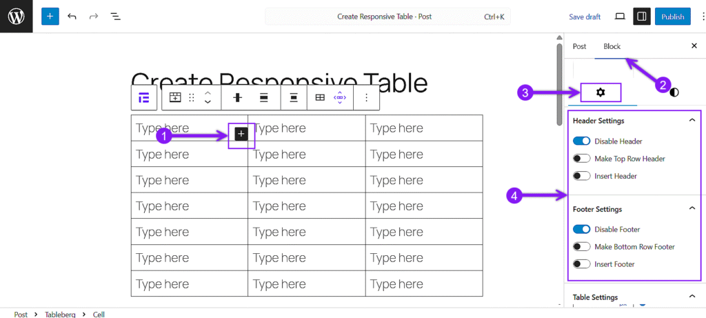
Click inside any cell and use the inserter to add the content you need. You can use a Paragraph block for plan titles, a List block for features, a Button block for call-to-actions, and Icons or Star Ratings wherever necessary. Just select the cell, click the Block inserter (+ icon), and choose the block you want to add based on your pricing structure. Use the General Block Setting to set up the header and footer if needed. Fill each section carefully based on your pricing structure.
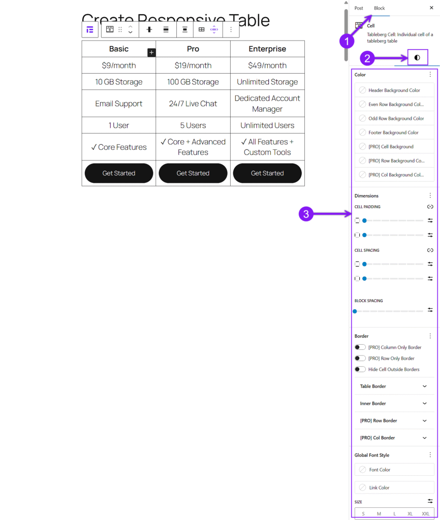
Step 4: Customize the Table Styles
Click on any cell, row, or column, then open the right sidebar and switch to the Estilos tab. From there, you can change background colors to highlight sections, adjust padding to add space inside cells, align text properly, and modify border width, color, and radius to separate areas cleanly.
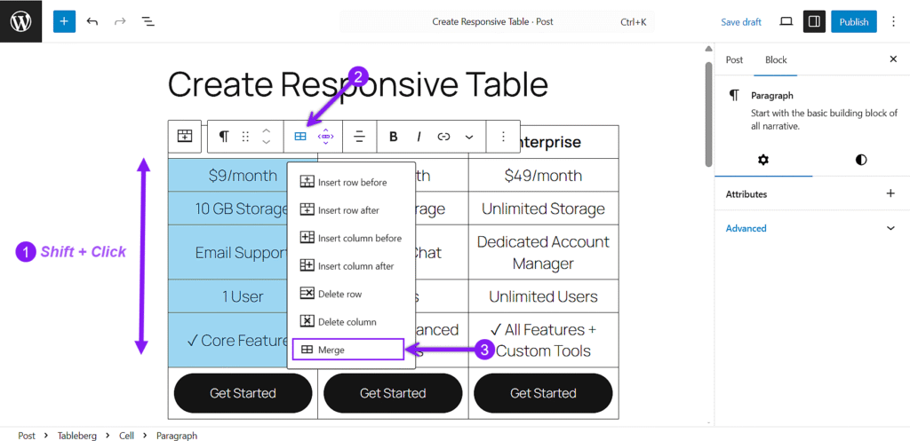
If you want to group elements or separate plans clearly, you can merge cells. Select the cells you want to merge, click the border of a selected cell, open the block toolbar dropdown, and choose Edit Table → Merge.
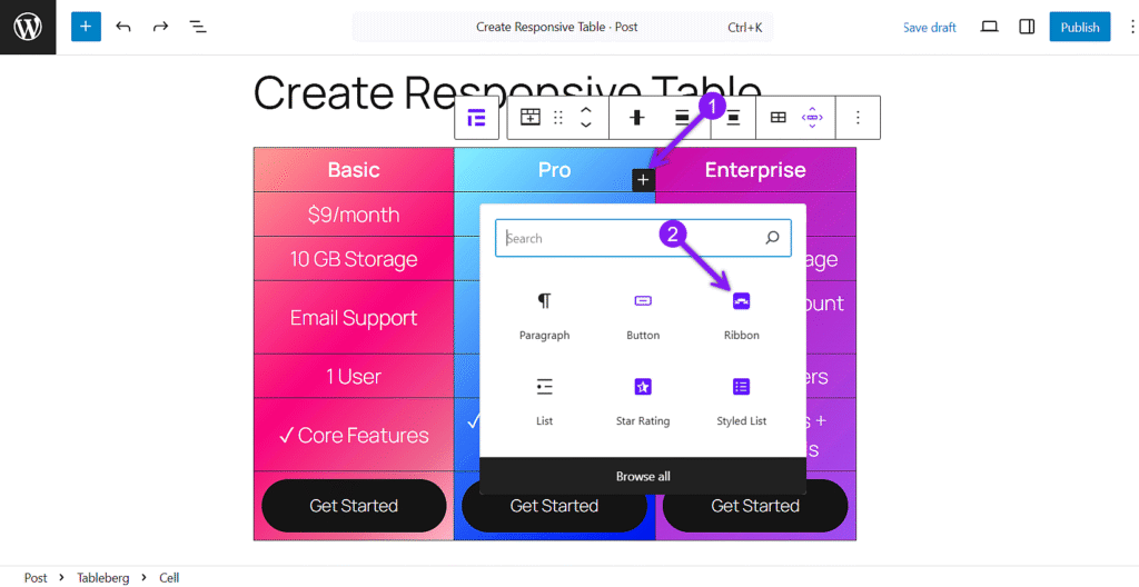
Step 5: Highlight the Best Value Plan
Click the column that contains your best offer. You can change the background color, add a ribbon label like “Best Value,” and modify the button design to draw instant attention.
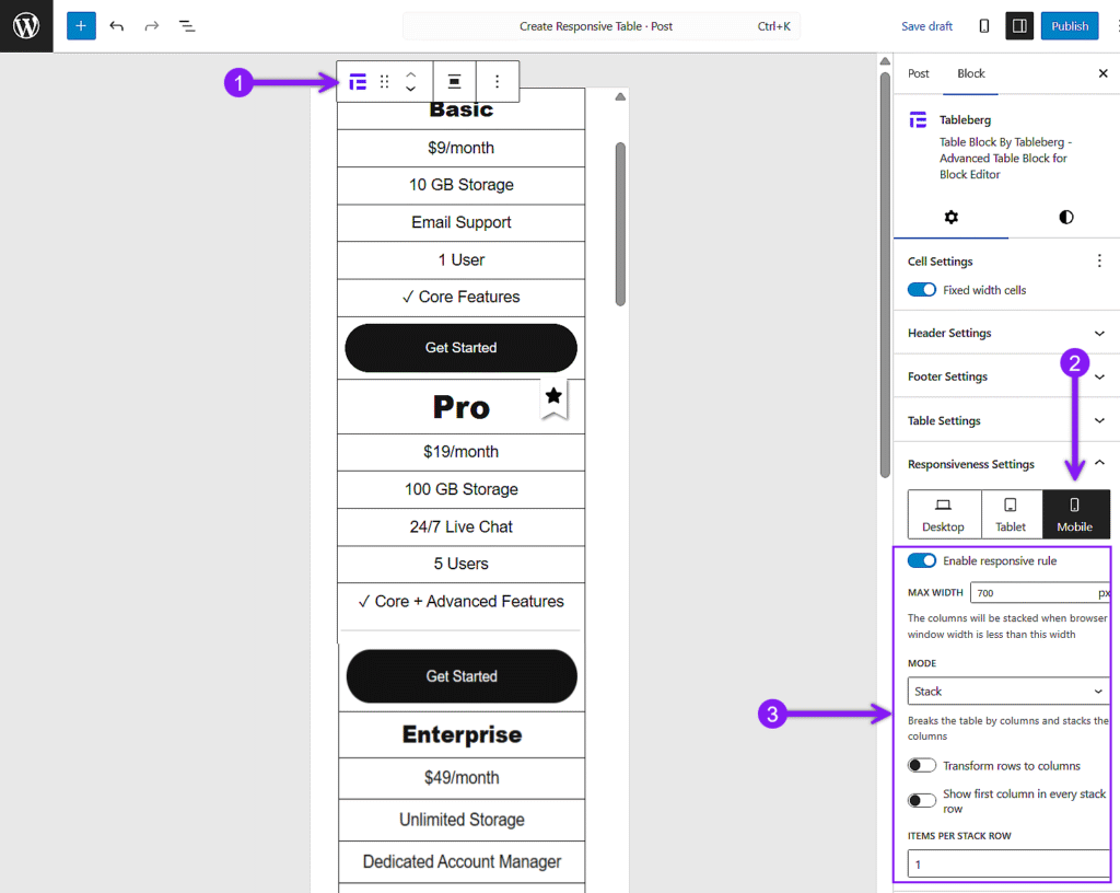
Step 6: Fine-Tune your table for Responsiveness
Select the parent Tableberg block and open the settings panel on the right. Scroll to Responsiveness Settings, choose Mobile, and toggle Enable Breakpoint. Set the Max Width to define when responsiveness starts, and toggle Make Top Row Header if needed. Under Mode, choose Scroll for horizontal swiping or Stack for vertical stacking. If using Stack, adjust Stack Direction and Items per Row for better control. Preview your table to check how it looks across different devices.
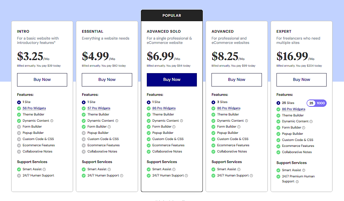
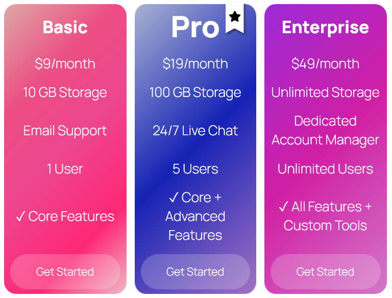
Step 7: Preview and Publish
Once everything looks good, don’t forget to preview your table on desktop, tablet, and mobile views to double-check. Once ready, click Publish to make it live. Here’s an example of how your pricing table could look following these steps:
Reflexiones finales
We have gone through everything you need, from adding your plans and styling them properly to setting up responsiveness the right way. You now have what it takes to create a pricing table that looks good, works on any device, and helps users choose faster.
As you build your table, keep a few things in mind. Make sure your best plan stands out without making the table feel crowded. Always check how it looks on mobile, not just desktop. And most importantly, keep it clear and simple. If users have to think too much, they will leave.
Take a little extra time setting things up now, and you will not have to fix anything later.
Lea también:
