
The Buttons Block is one of the most crucial elements in a WordPress website. The button lets you create important call-to-action buttons to capture your audience’s attention and guide them to take the next step.
It is also used to direct visitors to a product page, sign up for a newsletter, or download online resources. Today, in this guide, we will discuss the button block and how to use the button block in WordPress, as well as provide an overall overview of the plugin.
Create Beautiful Tables
With Block Editor
How to Use the Buttons Block in WordPress?
Using the Buttons block is super easy. It is a useful tool to boost conversions. All you need to know is how to use it. Make sure to follow the tutorial from start to finish.
Step 1: Insert the WordPress Buttons Block
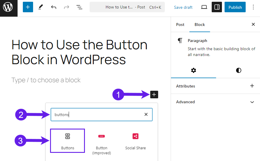
First, go to your post or page where you want to add the button block.
Click the Plus icon “+” (Add Block) (1), type “Buttons” in the search box (2), and click on the Button block (3).
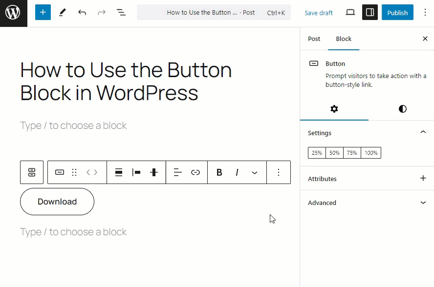
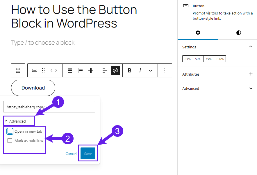
You must insert your button’s name and the link for the button after the button is inserted.
Here, you can also select how your button will work. For instance, you can set the button to open a link on a new page, make it a sponsored link, or mark it as nofollow. After that, you must click on the save button.
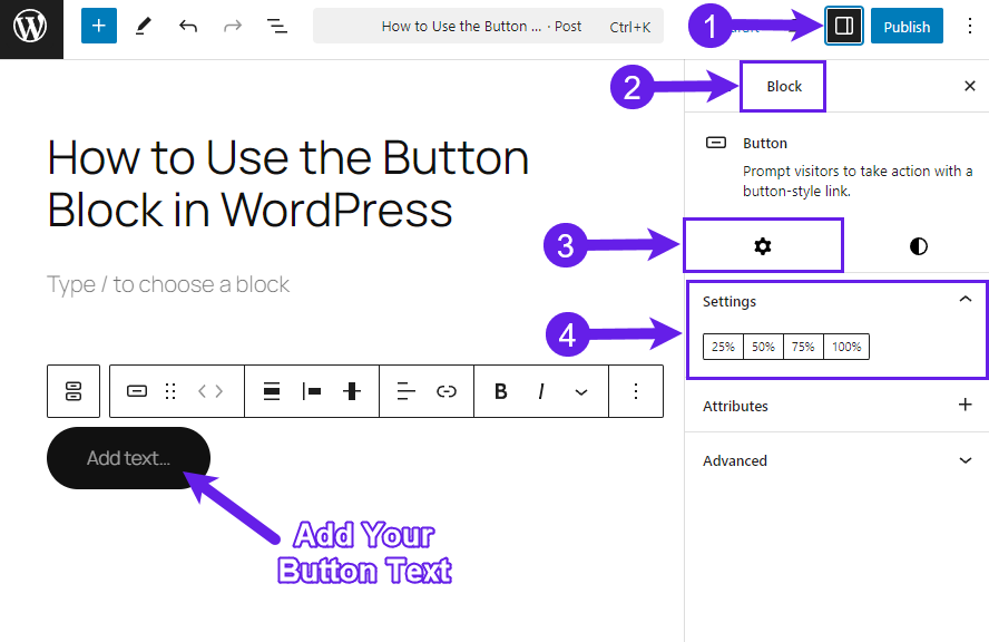
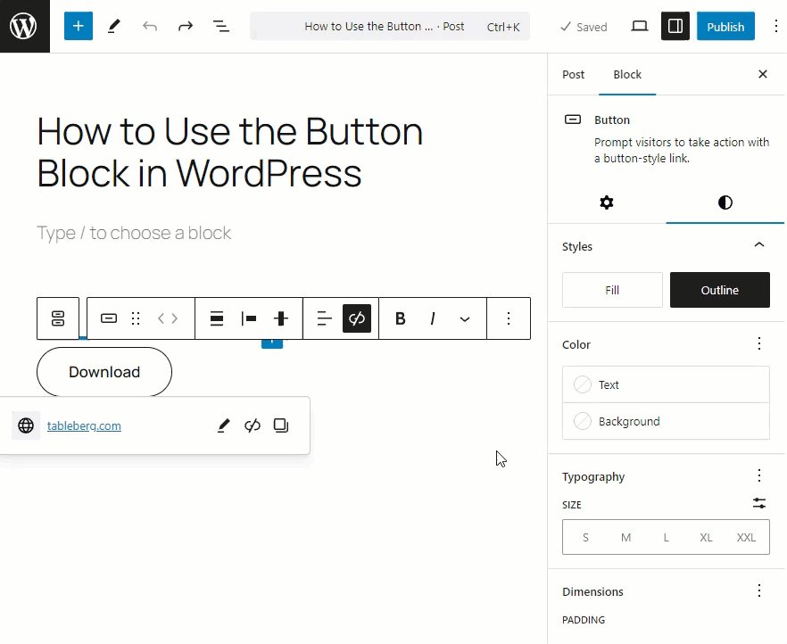
Step 2: Customize Your Button
Now, add the width of your button. Navigate to Settings (1 ) > Block (2) > Settings (3) > Settings (4). Select any percentage from the settings to select the width.
To further customize your button, go to the Styles tab. Select any style that suits you the best.
The Style tab has further options to customize your button.
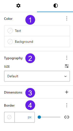
- Color: This function lets you change the color of your button’s text and background.
- Typography: The typography lets you select fonts & font size, appearance, line height, letter spacing, letter casing, and letter decoration.
- Dimensions: Dimensions allow you to adjust padding and margin for your buttons block.
- Border: The Border option lets you add border and border radius for your buttons block.
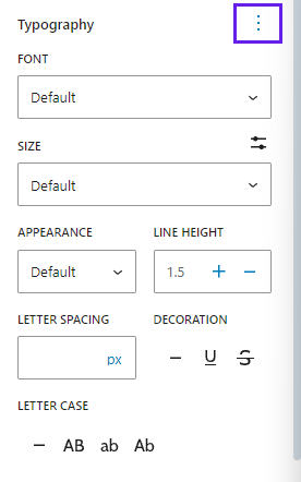
Based on the image above, you already know what can be done using the Typography option. But these functions are hidden by default. Therefore, to display those functions, you must click on the three dots at the top right side and select all the options to display in the editor.
The color option allows you to change the text and background color of your button.
If you want, you can select colors from the color picker too. Go to the button’s background (1), select Color (2), click on the color bar (3), and choose the color with the color picker (4).
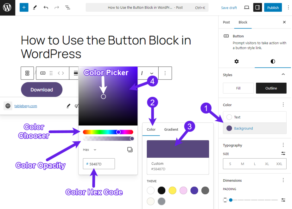
Also, you can make a gradient color for your button.
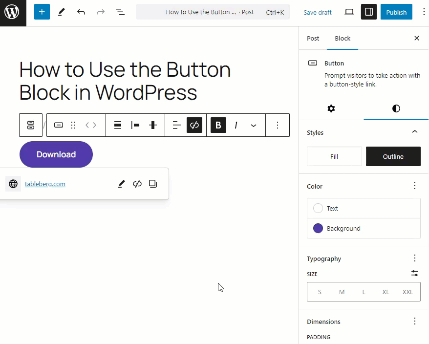
You can also bold and italicize the text of your button from the editor.
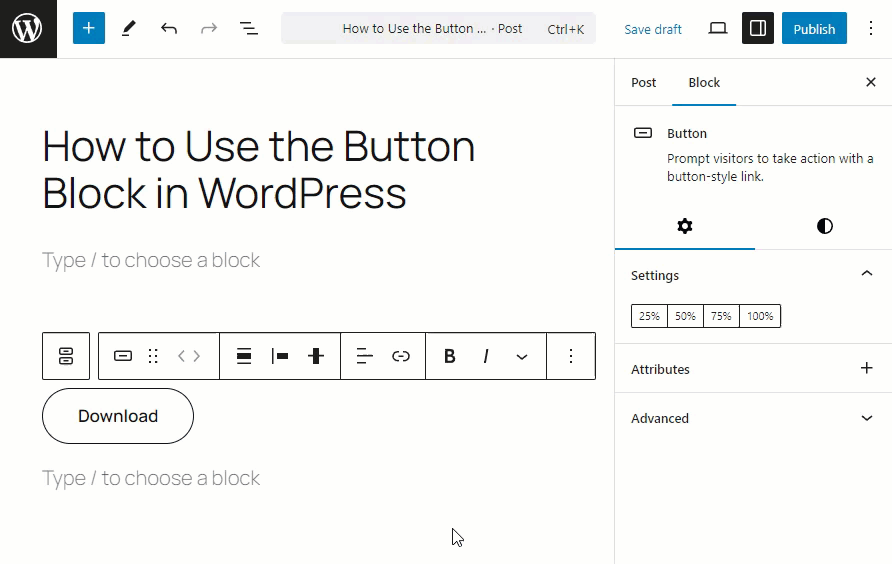
Below is a demo of a button that I’ve created for you.
If you want to create better CTA buttons, check out the Ultimate Blocks. It has an incredible collection of over 22+ blocks to enhance your WordPress content and engagement.
After all the modifications, you must save or publish your post or page.
Overview of the Buttons Block
Want to learn details about the Buttons block? Surf through the accordions below. It contains all the details about the block.
What is the Buttons Block in WordPress?
The Buttons block is a core block that lets you create amazing CTA buttons for your posts and pages.
It is a simple yet powerful tool to encourage interaction and guide users toward specific actions, such as visiting links or completing forms, downloading any resource, purchasing products, etc.
What Are the Key Features of the Button Block?
The Buttons block has numerous features to create incredible buttons that align with your website branding. Some of the key features are below.
-
Customizable Colors: Choose any color for your text and background to ensure your button matches your website’s theme.
-
Adjustable Button Width: You can select the width of the buttons from the block settings to align with your content.
-
Font and Alignment Options: Modify the button’s text size, style, and alignment for better visual impact.
-
Link Settings: Add links to your buttons with options to open the link in a new tab or add rel attributes like “nofollow.”
-
Gradient Button: You can create a gradient color for your button’s background to make your button look outstanding.
What are the Toolbar Features of the Buttons Block?
The toolbar that appears when you select the Button Block provides quick access to essential customization tools:
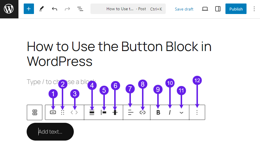
- Button Styles: Let you select button styles directly from the editor.
- Drag: You can drag and drop the particular block anywhere in the editor.
- Moving Handles: Let you move your block left and right.
- Align: Align allows you to set the alignment to none, wide width, and full width.
- Change Item Justification: It allows you to adjust the button’s position to Left, Center, Right, and Space between items.
- Change Vertical Alignment: Using this option, you can change the vertical alignment of the button to the top, middle, bottom, and Stretch it to fill.
- Alignt Text: This option is available when you add text to the button. You can align the text to the left, right, and center.
- Link: Let’s you add link for your button.
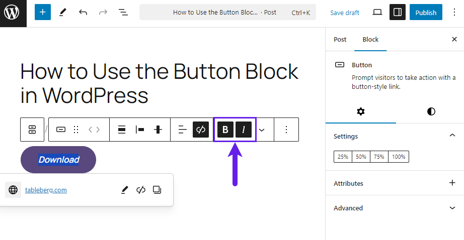
- Bold: You can put the file name you displayed in bold using the option.
- Italic: It lets you italicize the file name you displayed.
- Block Options: The block option features formatting options such as highlight, inline code, image, strikethrough, etc.
- Options: It holds block options such as the Copy, Duplicate, Add before, Copy Styles, etc.
Final Thoughts!
When you are making buttons, be thoughtful about your audience, as the button will make an impact on your visitors.
I hope the tutorial is easy to follow. If you’ve faced any trouble following the guidelines, let me know. I would be happy to help you.
Give it a try and use the buttons block. Master all of its functionality and get the conversions quickly.
Read More!

