
The Grid Block is a robust WordPress Gutenberg Block editor layout tool that allows you to create a multi-column layout without coding. It lets you arrange your content in a structured grid of rows and columns instead of being limited to a single column of text or media.
Designing magazine-style pages, portfolios, galleries, or other sections where you want to add content side by side is easier using the WordPress Grid Block. Today, we will explore how to use the Grid Block in WordPress and give you an overview.
Create Beautiful Tables
With Block Editor

How to Use the Grid Block in WordPress?
Now, let’s walk through a step-by-step guide on adding a Grid Block. These steps will help beginners and intermediate users make the most of this block.
But before following the steps, you must go to your post and the pages where you want to use the block. After that, follow the steps below.
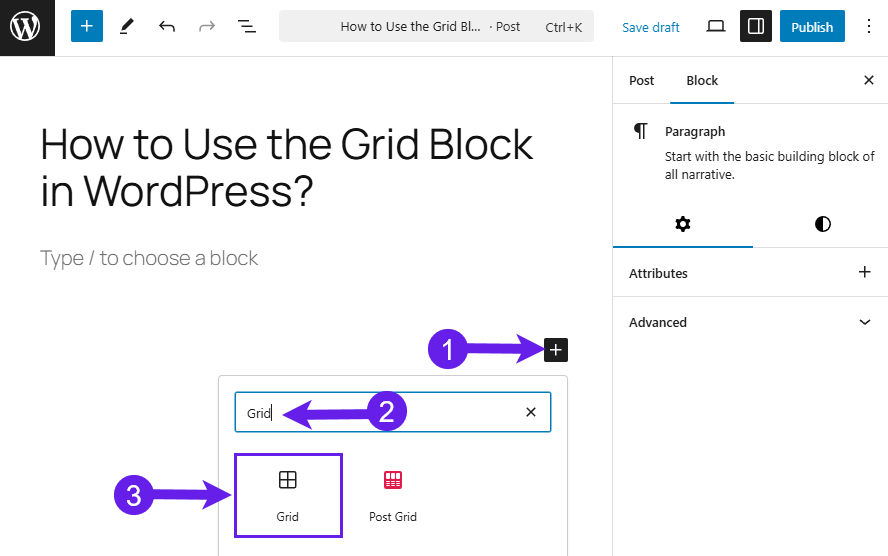
Insert the Grid Block
Click on the Add Block Icon (Plus Icon) (1), type “Grid” in the search box (2), and click on the block when it appears (3).
Insert Your Content
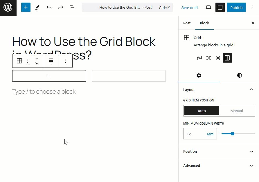
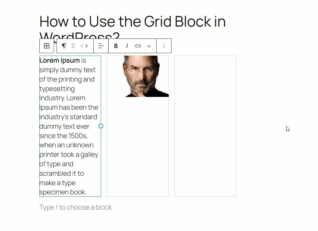
By Default, you will see that only two columns inserted for content. Insert your content by click on the + icon inside the block and then select your desired block.
Now insert other content or block by clicking at the bottom right side of the block.
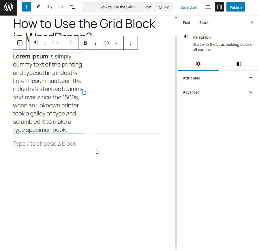
You can insert any block you like. For my case, I’ve inserted the image block.
You can insert set the column space for your each block.
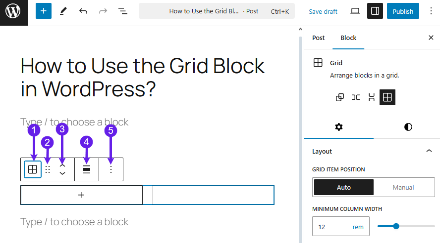
Block Customization
In the block customization, you get the options for the layout (1) and position (2).
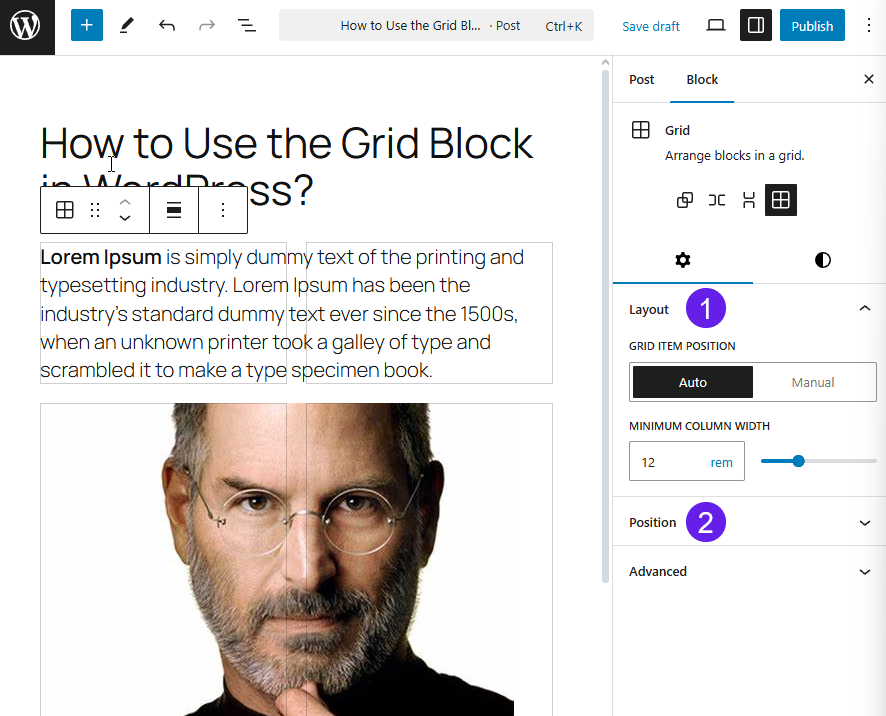
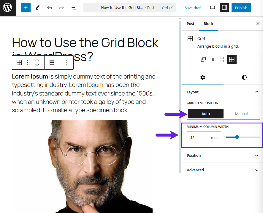
In the Layout, you can choose the Grid Item Position. You can keep it in default or go with the manual.
The Auto option lets you adjust the Minimum Column Width.
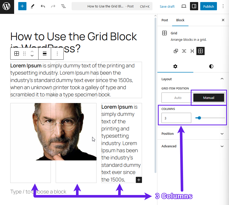
The manual option lets you choose the columns for the block. You can easily adjust the number of columns within the block.
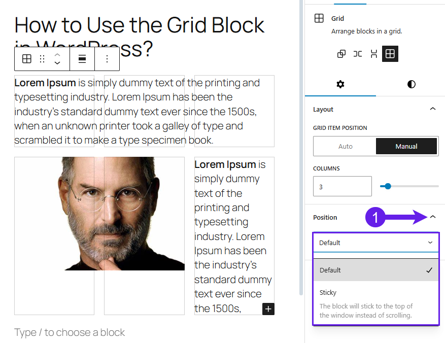
Next, you can choose whether to make your grid sticky or not. If you want to make it sticky, choose the sticky option.
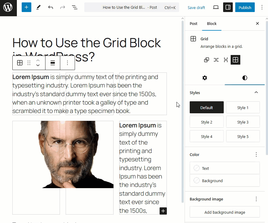
There are also prebuilt styles for the block in the Styles Tab. You can select and see what it does. Here’s the preview below.
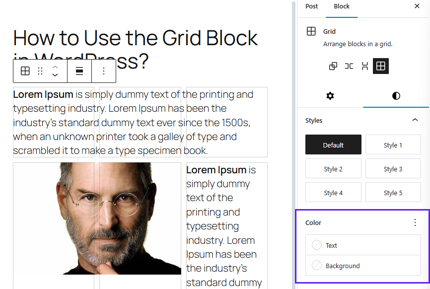
You can customize the text and background color using the Color option.
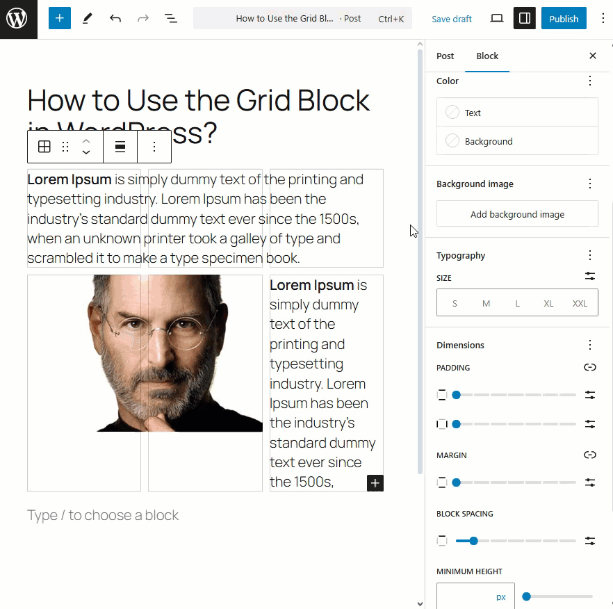
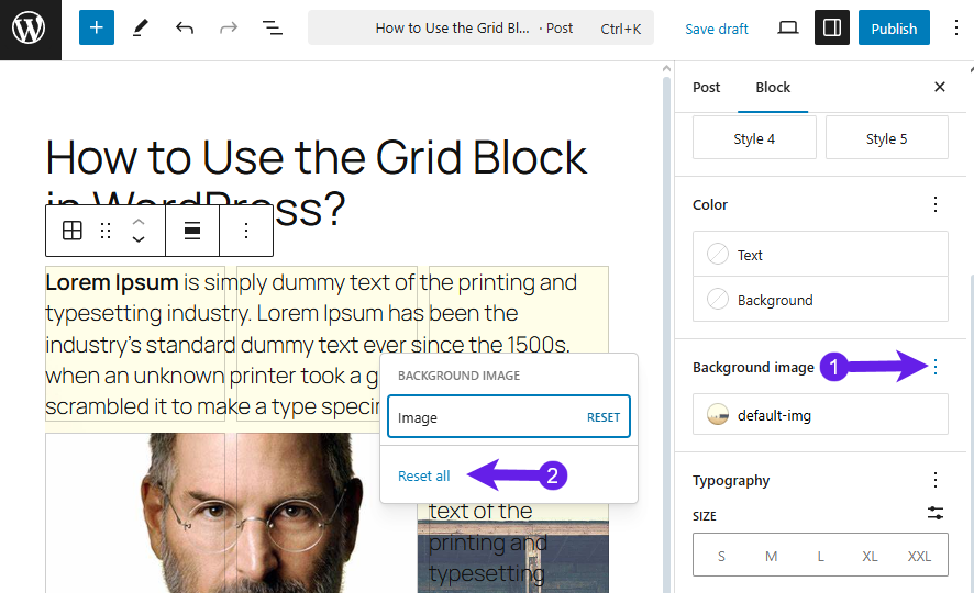
The Background image option lets you add an image for the block’s background.
To reset the image, click the three dots and select reset all.
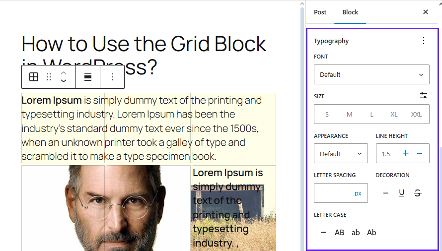
In the typography, you can set the font, font size, appearance, line height, letter spacing, decoration, and letter case.
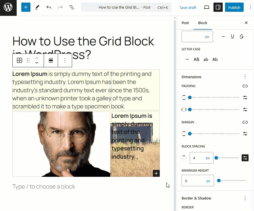
The dimensions let you customize the padding, margin, minimum height, and block spacing for the Grid block.
Let’s see the modification of the Block Spacing and Minimum Height below.
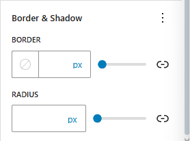
Lastly, the border & shadow option lets you adjust the border and border radius for the block.
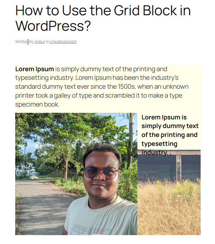
Here is the final demo of what I’ve made using the block. It’s not the best, but it gives ideas of what this block can do.
Overview of the WordPress Grid Block
What is the Grid Block in WordPress?
The Grid Block is a container block that holds all other blocks in a grid layout. In other words, it’s a parent block in which you can place multiple child blocks (like paragraphs, images, buttons, etc.), and it will arrange them in a series of columns. It automatically creates new rows as needed.
What are the Key Features of the Grid Block?
The Grid Block has several useful features, making it a versatile tool for building layouts. Here are some of the key features:
-
Flexible Column Layouts: You can choose how many columns you want in your grid. The Grid Block lets you set a specific number of columns or let WordPress automatically determine the number of columns based on a minimum column width.
-
Responsive Design: Content arranged in a Grid Block is mobile-friendly.
-
Content Arrangement and Reordering: It’s easy to arrange and rearrange blocks within the grid. You can drag and drop content blocks to different positions or use arrow keys to move them up/down within the Grid Block container.
-
Custom Styling Options: You can change the background color or add a background image to the section, adjust text colors for content inside, and tweak typography (font sizes, font families) all in one place.
What are the Toolbar Features of the Grid Block?
When you select the Grid Block in the editor, a block toolbar appears at the top of the block. This toolbar provides quick controls for common actions and customization.
- Transform: You can transform a Grid Block into a Group, Row, Stack, Cover, or Column block while preserving the inner content.
- Drag Handle: The six dots icon allows you to drag and move the entire Grid Block to a different position on your page.
- Move Up/Down: The up and down arrow icons let you nudge the Grid Block one position upward or downward in the document structure.
- Alignment (Width Alignment): The alignment icon lets you change the width setting of the Grid Block container.
- More Options: The three vertical dots open a dropdown menu with additional block options.
Final Thoughts!
The Grid Block is an awesome Block that is a fantastic addition to WordPress’s design Toolkit. It offers you the ability to create flexible and multi-column layouts easily.
Using the block, you can build more mesmerizing and engaging sections for your website. In summary, the Grid Block helps you break out of the single-column format and showcase content side by side in a clean grid structure.
Let me know your thoughts in the comment sections. Also, please share it with your friends using your social media.
Read More!

