
Tables aren’t just a way to organize content—they’re among the most powerful tools to drive engagement and conversions.
You might be comparing products, listing pricing plans, or showcasing features. How you design your tables in each case can mean the difference between a quick bounce and a new customer.
Here are 10 proven design tips to make your WordPress tables more persuasive and user-friendly.
1. Use Clear and Concise Headings
Your table headers guide users through the content, so make them count. Avoid vague labels like “Plan A” or “Stuff”—opt for clarity like:
-
Monthly Price/ Yearly Price
-
Included Features
-
Support Type

🧠 Pro Tip: Use benefit-focused headings like “What You Get” or “Best For” to help users make decisions faster.
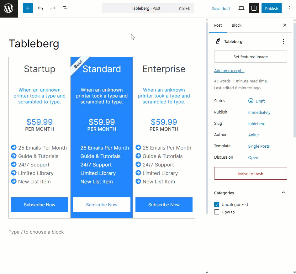
2. Highlight the Best Option
Most users skim tables looking for the “best” choice. Make that easy by:
-
Adding a “Best Value” badge
-
Highlighting a column with a background color
-
Bold the most popular features

🎯 This visual cue helps steer users toward the ideal option, without needing to read every word.
3. Keep Rows and Columns Balanced
Cluttered tables with 10+ columns or rows are overwhelming.
Stick to:
-
3 to 5 columns for comparisons
-
Concise rows that can be scanned in seconds

📏 Less is more when it comes to conversions.
4. Add Visual Cues (Icons, Images, Ratings)
Make your table content instantly understandable by using:
-
✅ / ❌ icons for feature availability
-
⭐ ratings for reviews
-
Product thumbnails or logos

🎨 These visuals grab attention and boost comprehension, especially on mobile.
5. Make It Mobile-Friendly
A high-converting table must work on all devices. Use a responsive table plugin like Tableberg to ensure:
-
Proper scaling on phones
-
No side-scrolling required
-
Tap-friendly buttons and links
📱 Mobile-first design isn’t optional anymore.
6. Use Contrasting Colors Strategically
Colors should guide the eye, not distract.
Use contrast to:
-
Emphasize CTAs or featured columns
-
Separate rows and sections
-
Improve accessibility (ensure text contrast meets standards)

🎨 Stick to your brand palette—but use accent colors for action areas.
7. Include a Clear Call-to-Action
Don’t just show features—guide action. Add
-
“Buy Now” or “Choose Plan” buttons
-
“Start Free Trial” links
-
Icons that hint at the next step

💬 Every table should help users move forward.
8. Group Related Information Together
Organize your data logically:
-
You must group pricing and features separately
-
Use dividers or background shading to separate sections

🧩 This reduces mental load and makes comparisons easier.
9. Keep Design Consistent
Your table should match your brand, not look like a bolt-on.
Use:
-
The same font styles and sizes
-
Uniform padding and spacing
-
Consistent button shapes/colors

🎯 Consistency builds trust and keeps your site looking polished.
10. Use Table Patterns for Faster Builds
No need to start from scratch every time. Use pre-built table patterns (like those in Tableberg) to launch quickly:
-
Pricing grids
-
Feature comparisons
-
Product tables

🕒 It saves time and ensures your tables follow proven UX patterns.
Final Thoughts
Great tables aren’t just functional—they’re persuasive. They guide users through choices, highlight key value points, and drive conversions when designed right.
If you’re looking to apply these tips effortlessly, try Tableberg. With built-in patterns, styling controls, media support, and responsive design, it’s the easiest way to build high-performing tables in WordPress.
✨ Design smart. Convert better. All with better tables.
Read More!

